Theme Typography
-
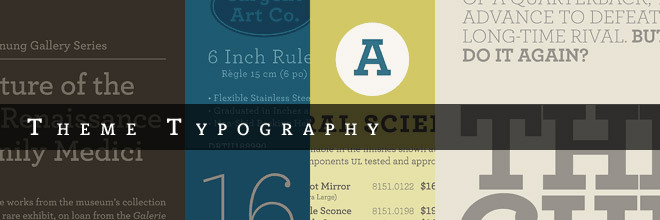
While custom control panels and plugins are great, one of the strongest points of Themeology is it’s meticulous attention to details in the area of typography. Every major type element has been addressed; You can even change both the Title Fonts and Body Fonts with the flip of a switch in the dashboard; Heck, you can even disable the title-font-replacement if you feeling like straight forward web-fonts instead of the flashy new stuff.
Custom Title Fonts
The theme comes pre-packaged with a very special version of the Mido Font, complete with ALL characters (including the funky stuff like $^*#@). That’s not all though, you can quickly switch to one of the other 5 font-styles included or turn font-replacement off altogether.
Custom Body Fonts
This brand new option in the control panel allows you to quickly flip between a “Serif” and a “Sans-Serif” font stack so that you have exactly what you need for your project. Additional tweaks can be made easily using a little CSS and the Firebug plugin if you so choose.
Superquotes
95% of the information on the web is written language. It is only logical to say that a web designer should get good training in the main discipline of shaping written information, in other words: Typography.Optimizing typography is optimizing readability, accessibility, usability(!), overall graphic balance. Organizing blocks of text and combining them with pictures, isn’t that what graphic designers, usability specialists, information architects do? So why is it such a neglected topic?
Back in 1969, Emil Ruder, a famous Swiss typographer, wrote on behalf of his contemporary print materials what we could easily say about our contemporary websites:
Standard Blockquotes
Today we are inundated with such an immense flood of printed matter that the value of the individual work has depreciated, for our harassed contemporaries simply cannot take everything that is printed today. It is the typographer’s task to divide up and organize and interpret this mass of printed matter in such a way that the reader will have a good chance of finding what is of interest to him.
With some imagination (replace print with online) this sounds like the job description of an information designer. It is the information designer’s task “to divide up and organize and interpret this mass of printed matter in such a way that the reader will have a good chance of finding what is of interest to him”.
Macro-typography (overall text-structure) in contrast to micro typography (detailed aspects of type and spacing) covers many aspects of what we nowadays call “information design”. So to speak, information designers nowadays do the job that typographers did 30 years ago:
